Having observed some images, Jim showed me a couple of his images done using Gaussian blur in Photoshop. So I decided to have a go myself using an old image of Santorini (after perusing a few candidate images).
I'd shot the original image in aperture mode at f22 at 28mm, the widest angle I could get - because the shot was of buildings moving away from me (and I wanted some of the opposite side of the Island in) I wanted maximum depth of field.
Here's the original image, tweaked a little in Lightroom for exposure and 'blacks'.
I then used Lightroom's 'Vibrance' and 'Clarity' (both at 75) to really pump up the colour - which gets it half way to that 'miniature' or 'model' world effect. A large dollop of sharpening was also added as I thought that defined edges would add further to the 'model' look.
The image was then exported to photoshop. Here I used Gaussian blur (1.6) to isolate a central strip of the shot to make it appear 'in focus'. For the background and sky I added more Gaussian blur (4.3) to try and give the village a 3D type effect. And here it is.

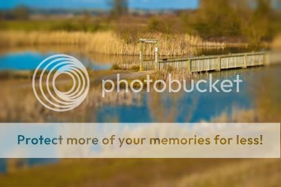
I then decided to go over to Ros Forest and saw the following opportunity for a 'Tilt Shift' shot. Now knowing that I need narrow depth of field I shot on aperture mode at f4.0, focusing in the bridge (the central theme). To crop out unwanted areas I had the lens at 44mm (as wide as I could go). Getting a really wide angle increases depth of field and maximises the 3D effect.

This one gave me invaluable learning. One of the requirements for creating good 'miniature images' is to get high above the subject - although I stood on a bench it just wasn't high enough. Equally I shot too close to the subject.
This shot required much more Gaussian blur. 7.0 for the background, 5.0 for the foreground and 3.5 for the near centre. It's all a bit too heavy handed. But hey I'm learning (I'll know what to do next time).

Revisited this after some advice from Jim ('ll fix it) via the comments boxes. Got the Gaussian blur up to 15 on the outside down to 2.5 nearer the bridge. Clarity & vibrancy at 75, and upped the Green, Blue & Red channels. I'm quite pleased with it.

Found a tutorial on tiltshiftphotgraphy.net and applied it to the same image - as follows and forsaking all modesty I prefer my own technique - the focus/blur is to parallel for me (the rectangle looks too obvious to me. However, I did use lens blur with this and Gaussian with the other, I much prefer the effects I was getting with lens blur. So, a merge of the two techniques is my way forward. For further info the tutorial suggested using a saturation layer and a curves layer. Whilst I found the saturation useful, I tried a levels layer and preferred it (even though I've clipped some darks and highlights).
Oh no! it's not the same picture. Right lets do it again with the right picture.

I then decided to go over to Ros Forest and saw the following opportunity for a 'Tilt Shift' shot. Now knowing that I need narrow depth of field I shot on aperture mode at f4.0, focusing in the bridge (the central theme). To crop out unwanted areas I had the lens at 44mm (as wide as I could go). Getting a really wide angle increases depth of field and maximises the 3D effect.

This one gave me invaluable learning. One of the requirements for creating good 'miniature images' is to get high above the subject - although I stood on a bench it just wasn't high enough. Equally I shot too close to the subject.
This shot required much more Gaussian blur. 7.0 for the background, 5.0 for the foreground and 3.5 for the near centre. It's all a bit too heavy handed. But hey I'm learning (I'll know what to do next time).

Revisited this after some advice from Jim ('ll fix it) via the comments boxes. Got the Gaussian blur up to 15 on the outside down to 2.5 nearer the bridge. Clarity & vibrancy at 75, and upped the Green, Blue & Red channels. I'm quite pleased with it.

Found a tutorial on tiltshiftphotgraphy.net and applied it to the same image - as follows and forsaking all modesty I prefer my own technique - the focus/blur is to parallel for me (the rectangle looks too obvious to me. However, I did use lens blur with this and Gaussian with the other, I much prefer the effects I was getting with lens blur. So, a merge of the two techniques is my way forward. For further info the tutorial suggested using a saturation layer and a curves layer. Whilst I found the saturation useful, I tried a levels layer and preferred it (even though I've clipped some darks and highlights).
Oh no! it's not the same picture. Right lets do it again with the right picture.


There is a photographer whose name escapes me at the moment, and I can't find my old stuff with his name, tht does something similar, and by using a mask he gets the sublect in the image to look like miniatures and somehow near 3D. will ask Mr Steve who it is.
ReplyDeleteThanks Eric, although Mr Steve couldn't remember on Saturday I hope you asking jogs his memory.
ReplyDeleteHi Joe
ReplyDeleteIt's amazing what Jim can Fix !
Hi Joe
ReplyDeleteWhat template are you using for your blog,I want one the same as yours where the text is spread right across the page :-))
Is this the Jim'l fix it blog ? ;-)
ReplyDeleteJim, thanks for all the comments - look forward to the article. And yep, as I look at the images I've since found the blur is definately more like the 9 you suggest. It'll be good to discuss that technique you mention - perhaps at the Zen!(how you saturate the primary? - just with the sliders?).
ReplyDeleteHello Steve - I'll show you the template on Saturday (I copied it from Ruth). I had that black one and it makes verrrrrryyyyyy looooonnnnnnggggg ppppppaaaaaggges.
ReplyDeleteHi
ReplyDeleteFor the amount of interest this has generated it a pity you cant use it for one of your themes, maybe next time.
Good work and feedback from your peers, this is a great way to work and pass on good practise.
steve
Hi
ReplyDeleteWhat I meant to say was in the context of landscapes as a theme as it works well for them.
steve