Showing posts with label P3. Show all posts

1.1 Trying Reportage

These images are from a few years ago when I was playing around with a reportage theme and B&W. I've included them to demonstrate the various approaches;

'The Decisive Moment'

Man in Chair (Utoxetter Races) - I'd seen him move towards the track and wanted that rear image.


Burton Bike Man
- I waited about an hour for a cyclist to come past (on the right type of bike) and to capture Drakelow towers that seemed to dominate the town.


Paddy
- I waited to create the idea that Paddy wasn't seeing the world and the world wasn't seeing him (except for the child). Knowing a child would do this I waited with Paddy for some time to capture the moment - pity I got the shutter speed all wrong.


'Contrast'


'The Man on The Bench'
(Bath) - and I wanted to contrast with seemingly oblivious people.


'Opportunistic'


The Cyclists at Leek (they woke up a few moments later and where from Canada, touring the UK by bike!).


Stapenhill Boy


Priests


'Bubbles in Bath' (taken in Bath) - I like that combination.


'Posed'

Beauty
- A posed image this time, Ben was selling the Big Issue and posed for this one. I love the juxtaposition of his own vanity (piercings , tattoos, chains and that of the Body Shop.

1.2 HDR - My First Dabble


I discovered the technique in Scott Kelby's LR2 guide book. I like his style, although some will hate it (just like marmite). I followed the technique as outlined - just as well because believe me I haven't got a clue how anyone worked this one out - there is nothing intuitive or logical in it to me (Kelby agrees - I feel better for that).

Oh, yes, High Dynamic Range - essentially its about merging separate shots of the same subject to produce the best possible image. The core idea is that you shoot one at the correct exposure and then one (or more) under and over exposed. The quality of darks, shadows and highlights of the 'merged' image dramatically improves. And, I have to say, even on only my first trial I'm getting the feel that all those magazine landscape covers are using this technique.

For HDR you have to shoot 'RAW' to be able to process it in Photoshop and that causes pain with the Nikon D70.

Setting the camera up was a real nightmare. I searched endless blogs for guidance. Everyone was having the same problem (its not intuitive on a Nikon D70). In the end it was down to reading the Nikon manual. If you ever recall those 'mystery books' as a child where you can choose the next step (go to page 10. for the Study or page 15. for the Library) - no! Well, anyway, you start at page 87 then get directed to 146 then to 135 on to 90 then to 144 and then to 35. There's a logic, but my advice, don't worry go with it (there's a song a there somewhere).

Here it is if you've got a Nikon;
There's a white bracketing option - but as it doesn't do RAW lets move on. Flash Bracketing - now lets come back to that in another section.

Then there's exposure bracketing - that'll be the one then. It can only be used with Manual, Aperture or Shutter priority modes - and Programme mode (a programme that you have created for the camera to follow).

The Nikon will only bracket 3 shots in RAW (and I'd love to see the effect from 5). Bracketing 9 shots sounds wild.

Go to your cameras menu, choose the pencil icon, then option 12. BKT and select AE & Flash.

Then go to option 13. BKT order - I chose 'Under>MTR>Over' - it does what it says - takes the shots in sequence - Under exposed - metered - over exposed.

Now to option 9. EV step - here you choose whether to keep the exposure adjustment to 0.33 steps or 0.5 (I chose 0.5 because with only 3 shots to play with I want maximum impact - if I had 5 shots to play with I would give 0.33 a try for more subtlety).

The maximum +/- exposure that bracketing will accept is 2 stops (and then it limits you to 2 shots, but at least you get to choose whether the 2nd shot is + or -.

Now to it. Press the BKT button (just below the mode selection dial on the left) then rotate the main dial (rear right of camera) and look for BKT in the LCD. Now rotate the sub command dial (front right) and choose the stop increment (notice it wall also display the number of shots 2/3.

That's it happy days.

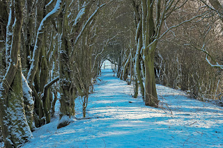
With that snow fall (winter 09/10) I got out in to Coton Forest, the light was low, shadows and highlights I thought - lets see what HDR does. I took a load of shots (all bracketed) and played around with various stops. The Nikon takes the shots as set up, mine from - to + (e.g. choose a full stop at '0' and it'll take them in sequence '-1', '0', '+1'. Now here's the interesting bit it won't take them automatically - you have to press the shutter x 3 (the LCD display shows if you've taken the 1st, 2nd or 3rd shot). Here's why that's not good. 'Clouds move'. You're set up on your tripod and press that shutter x3 as quick as you can (without causing any vibration) - but the clouds, yep, they've moved.

So for my next camera (whenever and whatever that is) I want auto shoot in bracketing and I want 5 shots.


The Shooting Process

This gets messy when you're first learning it.
Take a test shot to check composition and exposure (to set the initial stop for bracketing). I used the histogram on the Nikon for exposure, keeping it slightly towards dark (I prefer deep blacks and shadows).

Check the histogram, adjust a stop (or 2 if needs be) take another shot (beware you're not in bracketing mode, otherwise you've now got to reel off x 3 shots).

When you're happy with the histogram go to bracketing mode and set that exposure, and shoot x3.

It took me a while to get used to - taking off bracketing mode (otherwise you've now got another 2 shots to reel off), making sure the composition is right before I took the test shot for exposure, testing exposure (using the histogram) resetting to bracket mode (otherwise you'll now take 3 shots of the same exposure). Then of course if the light changes or you want to adjust the composition - you're back to step 1 in the whole process.

3 TIPS
(i) Use the image taken for exposure testing (metering) to also check you're happy with the composition. It's little hassle to adjust composition at this point and take another test shot.
(ii) Shooting RAW takes up space - lots of it, so delete the test shot after you're happy with the exposure and composition. It's the bracketed shots you're after and the middle one will be at the exposure you chose in the test shot anyway.

2.3 Studio Photography With Household Lights

I set myself up on the dining room table with a load of props (after the kids had gone to bed). My kit consisted of my Nikon D70, 28-80mm lens (with UV filter and hood), a manfrotto tripod and two lamps - a table lamp and a standard lamp (the tall ones), both with shades on - which helped me to direct the light to some degree.

All other lights were switched off to provide a great degree of control over shadows and highlights.

ISO was cranked up to 1600 (just like suzypaws did for her 'Live Rock Band' images).  I knew this would give me grain, particularly in the background but I was O.K. with that for 2 reasons (i) I wanted the backgrounds blurred anyway & (ii) I tried 800 it wasn't getting the results I wanted.

The D70's histogram was used to see how the overall exposure was going. I wanted some burning out in the high reflections so I used the 'clipping' function of the histogram that flashes in the areas of the image where the highlights are burned out. Using this facility I was able to get maximum reflection off the lights and only burn out where I wanted to burn out.

Here's how I got on.

Hey Hey Were The Monkeys
In all of the images I wanted the light coming from the left, with a burned out reflection spot on each Monkey's head. I achieved that objective but there's far too much shadow - and grain from the high ISO.

Shot 1.

TrialShootIn-House-1.jpg image by JoeFogg

I grouped them all in the first shot - f11 and 1/8 exposure. The tripod was  too far away and I had to use the lens at 80mm to close in (flattening the effect - the opposite of what I wanted!). I didn't like the look of them bunched either.

Shot 2.


TrialShootIn-House-2.jpg image by JoeFogg

The f11 gave too much depth so I opened up to f5.6 with 1/20 exposure to get a bit more light in (I also thought the previous image was too dark).

Shot 3


TrialShootIn-House-3.jpg image by JoeFogg

Now I've come in at 66mm, stayed with fll and gone for 1/30 exposure. I've spread the monkeys out - I much prefer this look, it easier on the eye, you can take a look around, it's not cluttered and confusing.

Shot 4.

TrialShootIn-House-4.jpg image by JoeFogg

Everything the same I've moved the tripod closer and gone to 60mm - it's getting better. The eye now has something to focus on when it first sees the image, it can then look around at the rest of the image.

I'm Leaving on a Jet Plane
I wanted good saturated colour, lots of reflections off of edges and curves.


Shot 1.


TrialShootIn-House-30.jpg image by JoeFogg

I wanted to get the jet in the background and so went back to - f11 and 1/8 exposure. I had to use the lens at 80mm to close in.

Shot 2.

TrialShootIn-House-31.jpg image by JoeFogg

I thought I'd be O.K. with the captain's legs cropped out but I wasn't so I adjusted to 75mm. I also adjusted the lamp to give more light to the bodies.

Shot 3

TrialShootIn-House-32.jpg image by JoeFogg

The plane was too sharp and distracted from the image so back to f5.6. I also turned the plane around, thinking it was too distracting. It ended up being to 'nebulus' although I liked the Captain sharp, the stewardess slightly blurred and the plane more so, it gives depth to the image.

Shot 4.

TrialShootIn-House-33.jpg image by JoeFogg
Reverted the plane to its original position stayed with the previous settings and hey presto.


Old McDonald
I got so much wrong with this one that I'll just show the one decent image (although the sheep's construction distracts from the rest of the image).

To get sharpness I used ISO 200 (see it can work - even in these conditions), f11 and got right up close with the lens, with 0.5 secs exposure.
TrialShootIn-House-10.jpg image by JoeFogg


She's My Japanese Girl
I fully expected to use a 'Japanes Cherry Blossom' picture as the backdrop for this. However the backdrop picture is only 12x8 so it'll need to be close in, otherwise I'll have more than that in the background. I chose 80mm to deliberately flatten the image. I knew I wanted a blurred backdrop in the final image. 


Shot 1.

TrialShootIn-House-11.jpg image by JoeFogg

I wondered if a white towel would work better than the brown dining table (used in all the other shots) and started off at f5.6. & 1/15th exposure. 

Shot 2.

TrialShootIn-House-13.jpg image by JoeFogg

The towel wasn't working so I decided to raise her on a box (no adjustments to settings),

Shot 3

TrialShootIn-House-22.jpg image by JoeFogg

Slight adjustment to get rid of the plinth (O.K. box).


Shot 4.

TrialShootIn-House-25.jpg image by JoeFogg

The final image tweaked in photoshop to hide the evident fact that I haven't kept my camera as clean as I'd like.

2.5 The Best of Tilt Shift Images

The technique is now often created 'post shoot' with a combination of Photoshop tools (and I dare say other editing photo suites offer the same functionality).

There also 'Tilt Shift' videos, that are 'sped up' to add to the impact.

All Images Courtesy of Smashing Magazine

2.6 Tilt Shift Trial - Photoshop Method

Having observed some images, Jim showed me a couple of his images done using Gaussian blur in Photoshop. So I decided to have a go myself using an old image of Santorini (after perusing a few candidate images).

I'd shot the original image in aperture mode at f22 at 28mm, the widest angle I could get - because the shot was of buildings moving away from me (and I wanted some of the opposite side of the Island in) I wanted maximum depth of field.

Here's the original image, tweaked a little in Lightroom for exposure and 'blacks'.
Photobucket

I then used Lightroom's 'Vibrance' and 'Clarity' (both at 75) to really pump up the colour - which gets it half way to that 'miniature' or 'model' world effect. A large dollop of sharpening was also added as I thought that defined edges would add further to the 'model' look.

The image was then exported to photoshop. Here I used Gaussian blur (1.6) to isolate a central strip of the shot to make it appear 'in focus'. For the background and sky I added more Gaussian blur (4.3) to try and give the village a 3D type effect. And here it is.
Photobucket 
I then decided to go over to Ros Forest  and saw the following opportunity for a 'Tilt Shift' shot. Now knowing that I need narrow depth of field I shot on aperture mode at f4.0, focusing in the bridge (the central theme). To crop out unwanted areas I had the lens at 44mm (as wide as I could go). Getting a really wide angle increases depth of field and maximises the 3D effect.
 Photobucket

This one gave me invaluable learning. One of the requirements for creating good 'miniature images' is to get high above the subject - although I stood on a bench it just wasn't high enough. Equally I shot too close to the subject.
This shot required much more Gaussian blur. 7.0 for the background, 5.0 for the foreground and 3.5 for the near centre. It's all a bit too heavy handed. But hey I'm learning (I'll know what to do next time).


Photobucket


Revisited this after some advice from Jim ('ll fix it) via the comments boxes. Got the Gaussian blur up to 15 on the outside down to 2.5 nearer the bridge. Clarity & vibrancy at 75, and upped the Green, Blue & Red channels. I'm quite pleased with it.

Photobucket
Found a tutorial on tiltshiftphotgraphy.net and applied it to the same image - as follows and forsaking all modesty I prefer my own technique - the focus/blur is to parallel for me (the rectangle looks too obvious to me. However, I did use lens blur with this and Gaussian with the other, I much prefer the effects I was getting with lens blur. So, a merge of the two techniques is my way forward. For further info the tutorial suggested using a saturation layer and a curves layer. Whilst I found the saturation useful, I tried a levels layer and preferred it (even though I've clipped some darks and highlights).


Oh no! it's not the same picture. Right lets do it again with the right picture.


2.7.2 Olivo Barbieri

The father of 'Tilt Shift' photography Barbieri is accredited with adapting the method to represent cities and scenes as miniature models. The effects are truly amazing and have created a new genre with an almost cult following. A search of any of the shared image sites will reveal budding 'Barbieri's'.

Barbieri is recognised for his innovative technique creating miniature still photography from actual landscapes by simulating shallow depth of field via the use of tilt-shift lens photography. Barbieri's technique simulates the shallow depth of field effect of macro photography by tilting the lens's angle to the back plane of the camera, which creates a gradual blurring at the top and bottom edges, or left and right edges of the filmed image.

The idea has also been used to create videos that look more like children's TV scenes (see my tilt shift blog for some fascinating videos). Interestingly, some of them 'appear' to recreate actual model scenes that might have been used for epic scenes in pre 2000 Hollywood films. Mostly, we look back at those old films, from a world of CGI capability etc., with almost humour and disbelief that we took them for real.

The converse appears to be true of Tilt Shift images - most people, initially at least, refuse to accept that they are real scenes and continue to believe that they are actually looking at miniature models.

Olivo Barbieri, Biography
Born in 1954 in Italy he is both an artist and photographer of urban environments.

Barbieri has exhibited his work at the Venice Biennale (1993, 1995, 1997), among other international exhibitions, and in galleries and museums throughout Europe, North America, and China. In 1996, the Museum Folkwang in Essen, Germany, devoted a retrospective to his work, which has been collected by museums worldwide. Barbieri has published several books of his work, including Notsofareast (Rome, 2002), Virtual Truths (Milan, 2001), Artificial Illuminations (Washington, D.C., 1998) and Paesaggi ibridi (Milan, 1996).

In an article in October 2008's Digital Camera magazine (thanks Jim, for providing a hard copy), Barbieri simply describes the technique as allowing him "to decide what stays in focus" A simple description for what, any of his images will show, is a very sophisticated eye for the genre. For the famous waterfall image of the Iguazu on the Argentina/Brazil border - just one from the 'Waterfall' collection - was actually created 'post-production' in Photoshop. He used a Fujifilm medium format camera with 180mm f3.2 lens.

He adds to his description be suggesting that with his images "the viewer is forced to read one line at a time" a comparison he makes with reading a book.

Without any technical training, describing himself as 'self-taught' Barbieri admits to studying the history of photography at Bolgna University.
He started exhibiting in 1978 and was influenced by Man Ray and Andy Warhol. The interest in creating 'miniature still life' was, he says, inspired by the work of Gherhard Richter. Barbieri was taking pictures of Italian football stadia when it occurred to him that they could be "transformed to look like models".

"It's very important" say Barbieri "for the cities to look like miniatures" adding that he started the series "because of an interest in philosophy and the philosophy of representation. I'm trying to understand how we perceive with different techniques of seeing. 

Asked about light on one of his images Barbieri reveals with striking honesty that it was about "being in the right place at the right time". He seems more concerned with architecture, its impact on man and re-representation of it. 

Get it while you can - "I believe that I'm coming to the end of this period in my photographic career - after all, I've been working on these images for almost 10 years" then offering respite with "I'm continually discovering new possibilities with my tilt and shift aerial work, so I'm not sure".

Barbieri's commitment to his work is revealed in his top tips;
  • I take about 60,000 images and save about 12
  • There are no short cuts in pro-photography, you have to put the work in
  • Be aware of how to improve, learn from what others are doing
Replacing Awe with Aw
Now for a slide show of his work. As I pondered the images, it occurred to me that all of them are of fairly significant natural or man made constructions. Each of them has the capacity to strike awe in to the observer; New York, Las Vegas, or Rome. Is transforming these places to a miniature, more acceptable scale an attempt remove the 'awe' and replace with 'aw' as in "aw shucks" or "how sweet"?


2.7.4 David Allan Brandt

The moment I clicked on the website - I was moved. Immediately, involuntarily I was moved deep inside my being. Perhaps like nothing since Salgado, Capa or Aget. In fact nothing like since seeing Salgado's images in full glory at the Tate Modern.

I'm a big fan of Edward Hopper and his unique depictions of people and space. These Hopper pictures came rushing in to my mind as soon as I saw Brandt's images.

And now Brandt's

29.jpg image by JoeFogg

17420982156253113985.jpg image by JoeFogg
17865461328312548766.jpg image by JoeFogg

The similarities in the use of colour, texture and shadow are fascinating. Brandt does not quote Hopper as a source of inspiration but the parallels are intriguing.


Brandt's subjects seem vulnerable despite the contrasting settings. We see a bedroom that's looks worn and shabby and the physical expression of despair or scream a cry for help the classic 'lord give me strength position'.

In the next picture the subject is isolated in isolation. barren and bereft almost of colour too. The two pastel colours, occupying the upper two thirds of the frame, by the absence of all else feature strongly - a true less is more composition. In Hopper's images the natural light offers warmth and hope - Brandt's by comparison seem to say 'it is as it is'. The figure standing on the stair adopts a posture of arms to the sides - removing the defensive position of arms in front or folded. Body language is critical in conveying messages (as are facial expressions). This subject says this is my world I am resigned to it, yet the leg posture says I am relaxed and comfortable with myself. The cold of the blue and warmth of the yellow act like yin/yang to balance each other. Hence we do not feel concerned for the subject we admire the soft beauty of it. Even though the figure is small within the space we enjoy the colour and texture. The foreboding doorway concerns us not. Perhaps the placing subject at the top of stairs and towards the edge gives the subject the power of control. She is relaxed, not running away (whether up or down), she is not jumping over the edge, She has choices and is comfortable with them.

Then we have a young girl in what we would take to be an older person room (the furniture, bed covers and lace mat beneath the flowers). So the subject - a young girl - may look out of place. But somehow she doesn't. The rather dejected, helpless pose (slumped shoulders, hands held in a defensive position, feet towards each other) all suggest that she is sheltering in someone elses room. Refuge from a harsher life. She is not entirely comfortable here but is safe (knees apart tell us that she feels safe).  The body language is strong and so Brandt also use the room to tell the story. If the room were occupied by contemporary furniture from say IKEA, then we may find a different story for the body language. Each combine to provide signposts for the story. Here the light is behind her, leaving her in shadow - the opposite of Hopper's pictures.

Finally we have a subject placed smack centre in ostentatious surroundings. The light is behind and to the side of her - but not on her. She is looking way from us with her face in shadow. Not quite comfortable with it all. She leans towards the shadows (ever so slightly) her legs point to the shadows and somewhere to the side and beyond the camera. That's where she wants to be - out of the picture, out of the 'limelight'.

We will see this same spaces occupied in entirely different ways in Brandt's other images.


I've put together  a slide show of Brandt's images, from different portfolios, that depict or contain religious iconography. The Christian cross appears on the wall behind the girl and on the chest of a male. In other the cross is being formed either by people or in the case of the man in the water by the shape of the water filling in the gap between decking and man. There is the use of the 'prayer' handclasp and the classic meditation pose perhaps most often associated with Buddhism and Taoism. Whilst Brand does not make mention of this use of iconography, in his published work it is a recurring, if subconscious, theme.


Biography
David Allan Brandt has created a vast body of work, which includes a surreal series of romantic worldscapes combining people with urban structures and whimsical dreamlike environments. These elegant black & white and color creations along with his fashion work and environmental and studio portraiture make up a series of beautifully designed images that show his artistic versatility. David began his career as a photojournalist, then attended and graduated from Art Center College of Design, while still in college he became staff photographer with EMI Records. He later opened his own studio in Los Angeles which serves as his home base for international travels, producing advertising campaigns for American Airlines, Sony, AT&T, Hennessy, Canon, Mercedes Benz, Microsoft, Estee Lauder, K Swiss, Nokia, Hitachi, Kawasaki, Palm and Visa to name a few. His commercial work along with his personal projects that range from the conventional to the abstract is always a search for using the ordinary to create the extraordinary expression of life and art. His images have won him numerous awards from around the world, including Archive, Communication Arts, Graphis, American Photography, PDN and many more as well as having his work featured in several of these and other books, publications and exhibitions.


Here's another slide show I've put together, this time moving through portrait studio work, to location work and on to, using Brandt's own words, 'conceptual & narrative' images.

Drtikol's work too. We then see the use of colour and emotion before the location shots (ah but are the first few, very well propped studio shots). The emotive shots really stuck a chord with me and have given me a different idea for my portrait theme. I'm getting the sense that I'd like to bring someone in get a few shots of their 'normal' state and then encourage them to liberate their emotions, remove inhibition and see what we get. The idea would work well a 'campaign' to promote greater understanding/diversity in business.

Back to Mr Brandt. The show finishes with reportage style images and finally a departure from the norm and the striking use of colour reminiscent of Martin Parr and his 'Last Resort' images.


2.7.11 Sandy Skoglund

I came across Sandy's work whilst looking for someone else. The use of vibrant colour struck me before the beautifully constructed & surreal imagery. 


Skoglund is classed as a photographer and installation artist. Seeing the complexity of the installations I'm given to thinking that she is primarily a creator of physical imagery (3d) and then captures them visually in a way that represents them in a virtual (2d) world.


This work does not directly impact my proposed work, however, I have included it here to remind me of the importance of colour, lighting and most importantly the painstaking work involved in preparation for creation of truly beautiful images.


It is also included as an example of stunning visual imagery that once articulated has probably lost its essence.


Sandy Skoglund Slideshow
I have arranged the images in order of colour and theme. I have include three different published versions of the same shot from the installation 'Radioactive cats' (1981) moving from lighter to darker. This alters the aspect of the image. for me. entirely.


In the first (lightest image) everyone is radioactive, in the second, the cats have brought radioactivity in to the room and in the third the men have brought radio activity to the cats. 


4.1 My Portrait Theme Choice - CANCELLED

These influences have lead to my portrait theme choice "You Bring It To Life".

The underlying idea is a 'travel advertising' shoot. Using shadows/silhouettes to depict iconic locations e.g. the Eiffel Tower, the Statue of Liberty and safari animals. By introducing people in full colour, in typical holiday regalia, the contrast then supports the tag line "you bring it to life".

What is a Silhouette? - well according to the fountain of all knowledge - Wikipedia "A silhouette is a view of an object or scene consisting of the outline and a featureless interior, with the silhouetted object usually being black. The term was initially applied in the 18th century to portraits or other pictorial representations cut from thin black card". Perfect.


The term has also (from the same source) "....been extended to describe the sight or image of a person, object or scene that is back lit, and appears dark against a lighter background. Double perfect (if a man can say such a thing).


This effect has been used to create a very specific genre of theatre "shadow". Its history can be dated beyond the 13th century in China. Today there are over 20 countries with 'troupes' performing the genre.' Pilobolus' are an American troupe originating from New York City. Following widespread exposure on US TV, they have since appeared around the world, featuring on
the UK's Royal Variety Performance show of 2009.


The following images show how the effect can be created.


Because a silhouette emphasises the outline, the word has also been used in the fields of fashion and fitness to describe the shape of a person's body or the shape created by wearing clothing of a particular style or period.

Because of the limitations of studio space I will need to back light 'small' silhouettes to then projected 'larger' shadows on to a white background.

4.2 My Portraits

Here's a range of portraits covering posed to candid, all with natural light. Photoshop effects have been used for one - used because I felt it suited (reflected) Ben's personality (and I got to play with effects I usually steer a million miles from).


This one may look like it's in a studio but it's actually taken at the top of one of those inflatable slides - with a zoom lens). PhotoShop was used to burn out the already completely white background.