New York based commercial photographer Chris Collins has spent the last 20 years combining creative problem solving, technical expertise, and often a hefty dose of humor to create work that attracts big name clients including the likes of SAB Miller, Calvin Klein, Estee Lauder, Nike, American Express, AT& T, Cannon, Du Pont, Estee Lauder, General Foods, IBM, Pepsi, Philip Morris and Panasonic (phew!) Steve Madden and Verizon. One of his Oneida ads earned him a coveted Clio Award for creative excellence.
At various stages of his career he’s been known as New York’s expert animal, liquor, and water-effects photographer, although he has avoided having a set style, preferring to let the subject speak for itself. “I don’t think my ego is as important as trying to communicate what the ad is trying to say,” Collins explains.
Known for flaw-less lighting and clever, often whimsical concepts, when asked if he's ever lost his cool in the face of flying frogs or other impediments, Collins admits, "Sure, I get aggravated occasionally. But I get myself calmed down and make it a point never to blow my cool or get too excited in front of a client. I proceed on the assumption that, if you keep on chopping, the tree will eventually fall. There's always a way to get the job done." Truly inspirational words from a modern master.
There's also an inspirational story behind the master. Collins didn't take up photography until his mid twenties. He attended a local camera club and discovered that there was such a thing as commercial photography. Collins approached the presenting photography and asked for a job and was taken on. At 29 he started doing some of his own shoots, whilst using weddings and model portfolios to pay the bills. His first breakthrough came when he approached a paperback book publisher with his work and was commissioned to produce book covers. It was Avon that provided the first product break-through. He was assigned to shoot some moisturising creams - "Avon used to support half of the photo industry in New York City" say Collins.
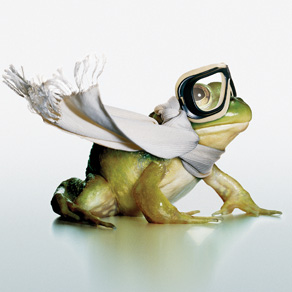
A now defunct Internet company, Reebate.com, commissioned Collins to promote a program in which participants won a scooter. To make the frog appear road ready, Collins took two shots. The first, of the frog, was easy to set up, as being cold-blooded creatures, they move very slowly (and apparently frogs don’t hop as much as you’d expect). He exaggerated the frog’s features by using a 40mm wide-angle lens and a 6-inch bank light with a Speedotron 2,400-watt strobe. (Small animals prefer small flashes, he says). A metallic background made clean-up of the frog prints easier. For the next shot, Collins hung a scarf and goggles at a 90-degree vertical, and placed a fan directly beneath to make the scarf appear to flap in the breeze. Shooting the scarf horizontally would have required a high power fan, and that would have blurred the scarf. Collins needed to match the angle and brightness of light in the second shot, in order to make the combination appear seamless. He placed a proportionately larger three-foot Speedotron 2400-watt bank light and the same camera 90 degrees from their positions for the frog shot.
We can see ourselves that the Frogs eye has been captured in focused with a nice highlight created by reflection of the lights. The overhead lighting gives the frog a reflection and shadow, whilst still retaining a unified surface/background. This effect ensures the frog is connected to the surface and does not appear to be floating in thin air.
We can see ourselves that the Frogs eye has been captured in focused with a nice highlight created by reflection of the lights. The overhead lighting gives the frog a reflection and shadow, whilst still retaining a unified surface/background. This effect ensures the frog is connected to the surface and does not appear to be floating in thin air.
When Crown Royal asked Collins to personify their bottle, Collins decided a prop maker could give the campaign the continuity of style it needed. Each of the four shots in this series had to be carefully planned before shooting, because variations with props are difficult to achieve. Prop builder Christo Holloway from Clockwork Apple Studios built Styrofoam and mat board stand-in props to determine the appropriate sizes for the bottle-sized band gear, then came back a week later with the real props seen here. After that, the most important step was to create appropriate lighting. Collins lit the scene dimly, with a weak Speedotron bank light, and shot an underexposure with a Toyo 4 x 5 and 90mm Nikkor lens. Collins then used a technique called “light painting” to add in the spotlight effects. In complete darkness, Collins opened the Toyo’s shutter, then used a Hose Master fiber optic light to “paint” in more exposure on the singer and the back-up band. Collins says, “It’s very important to know when to use a model builder and when to use Photoshop.”

Collins normally relies on animal talent scouts to find larger animals, but for this shot he headed to the Central Park Zoo during feeding time, when sea lions are in heads-up position. Zookeepers did not let Collins inside the sea lion habitat, so he used a Nikkor 180mm fast-focusing telephoto lens on a Nikon F100 AutoFocus camera. “I tried it without AutoFocus, but forget it!” Collins says. Back in his studio, Collins carefully created the spoon shot.

Unlike the scarf in the frog image, the spoon here had to be positioned more exactly, due to the sea lion’s tilting profile. Collins then traced the sea lion image onto an acetate then placed the acetate directly on the ground lens inside his camera.
When Collins looked through the viewfinder, he was able to find the perfect position for the spoon. He double-checked the lighting, which he supplied with a Speedotron 2400-watt strobe topped with a Lee CTB
The following image reminded of Sandy Skoglund's work, however, whereas Skoglund used models (created installations) Collins has used live frogs. Research has identified that the technique involved chilling the frogs down )in cold water) to slow their responses then warming them up just enough to get them to jump in slow motion. Some photoshoping was done to create the final image. The orderly structure of the storage shelving contrasts with the mayhem of escaped frogs.

In the following shot the whole scene has been constructed. My interest relates to the similarities of the challenge of photographing highly saturated subjects that are also highly reflective. A nice cauliflower tree at the front helps to frame and add to depth. Lighting has been used to give the effect of a gentle warm sun from the left (East/West? sunrise/sunset?). Now this is a challenging one to assess for me. Collins is so meticulous about his light that i cannot figure why the aubergines would have that reflection when the lighting indicates that side of them should be in shade. Knowing Collins combination of techniques I would suggest that Collins own softboxes were used to provide the diffused light, coming from the right, and that photoshop was used to bring out highlights on the tips of some of the smaller fruits. This approach adds to the effect of texture in the images as well as creating an undulating feeling, much as you would expect in a 'landscape' shot.

For me this shot is lot harder than it looks. The butter is a very pale yellow and would blend in to a light background, yet a dark background would detract from the angelic image created. Hence a graduated background. The line of the knife whilst reminding us that this is butter also acts to lead us in. The dark edge acts as a pointer whilst the cleverly positioned front lighting creates clean highlights on the knife without distracting reflections. The angels wings have a glow and this must be achieved by lighting from the left hand rear side. The use of the word butter on the wrapper is almost subliminal. A number of factors combine to help bring a 3D feel (that Collins desires in product shots); the angle of the knife (foreground), the subject itself and then the subtle edges of the wrapper around the base of the subject - there to give depth but blurred (not to cause distraction) and lit to (not to darkness) and reflection that leads gently back to give depth. The light to the top right is distracting for me. It could be a sun, but it's shining from the wrong direction. Perhaps a gradient background from the current dark at the top right move to white as it approaches the opposite co

A duck - also seen in Steve Bronstein's work. We can see from where the light falls and also the shadows that this subject is light from the front left (225 degrees / 7/8 o'clock?). Collins knows how water affects light and will have planned for light to hit the water such that it back lights whilst providing a shadow at the front left. I'd expect the top left has been darkened in photoshop. The movement of the water, the strong shadows, strong highlights and texture (created by light) on the wings help with that 3D effect again.


What a great story. The corkscrews conspire to open the bottle. The shadows suggest some form or caging that is keeping the wine safe. Yet the shadows also speak of a gentle sunlight. The keyhole effect creates a similar story (corkscrew getting at the wine seemingly unobserved). 3D creating techniques include the shadows on the left bottle, reflections on the right and dark edges to the left edge and bottom of both bottles). The corkscrews have great highlights and shadows that allow them to exist without either washing out or becoming to defined.
Whilst the story is about making whisky a drink for many occasions for everyone (e.g. birthdays) the poster like approach could lead to a flat image. The angle allows the candles to reach down from us to the subject providing depth (a shot taken across the would have resulted in some very distracting candles) the shadows add to the depth as does the darkening on the background. The cleverly removed 'slice' heightens the effect. There are some strong highlights to the top right of the subject and I'm not sure why (perhaps to suggest that people are surrounding the cake). The highlights down the left suggest that light is coming from the person slicing.

Immediately a great shot. But hold on light from the rear of the right leg (as we look) shadows off to the front and left, a highlight on the left heel, highlights on the left toe, highlights down the middle of the legs suggesting light from the front. How can this be. It suggests that this image is more concerned with providing a strong, contrasting picture with depth than it is with creating reality (after all its the Wizard of OZ you know - The yellow brick road and those shoes.). Dappled light is suggested by the shadows created on the yellow brick road.

A beautifully created model. The lines of the planks draw us across and then up to the subject. The rule of thirds in full swing. A nice line across the centre asks us to pause and look there.

Depth created by the way the cones move away from us. Notice how the lower 'jaw' has smaller front teeth than the upper 'jaw'. Whilst perhaps necessary to simulate a 'biting' mouth it also suggests that scaled models or photoshop was used to create this image. Thus is the light real or fabricated? Certainly the centre lighting causes us to look in to the mouth and the upper and lower edge shadows providing a none distracting background and further depth.

The use of the flowers immediately suggests 'funeral' or 'grave' and supports the book title. The pale colours would easily wash out. A low power setting with diffusers will have been used from overhead. Raising some flowers above others (thus catching more light and creating subtle shadows) along with small gaps of dark, create a depth and texture.

Great models - lighting from the top left (45 degrees) with a good back light and perhaps the use of filters or gels.

Reflections suggest three lights (snoots perhaps). Besides nice reflections one of them ensures the smoke gets highlighted whilst the background remains black. this top light is also used to give the top of the fuse prominence whilst the right side light gives the fuse length (through quickly contrasting light and shadow).

Soft light from the right and top ensure the box gets prominence whilst the inside of the shell gets shadow to give depth. The inclusion of the shell and the yellow background (suggesting yolk) help to reinforce the message that this product is made from 'real eggs'.

Highlights on the higher surfaces towards the top suggests lazing in an afternoon sun. This also allows the central subject to take prominence. The smaller undulating m&ms give texture and depth, particularly with the shadows in their recesses.

Now if asked - I couldn't tell you what this image is promoting (and its the first time). Is it clothing or the appliance? lights seem to be; wide and sharp from above to get a highlight on that inside top edge and create those shadows at the bottom, a wide medium light at the left side for the door, a narrow sharp light at the bottom, angled up, for the lower drawer and a very soft light towards the top of the right hand side panel. Without any distractions our eyes focus on the subject. The subject has hard edges to provide depth, along with bright spot lights on the background providing and aligning colour scheme.

The tungsten light here is evidently provided from within the subject itself. Also notice the reflections on the arms, legs and feelers as well as the outside edges of the body. The shell reflections suggest two long narrow soft boxes at work.

And a departure from studio product photograph for this one. It resonates with tilt-shift. Is it real or a model. The highlights at the bottom and middle of the 'flat iron' and the brightness of the snow along the ground would suggest that at least photoshop has been at work. The sky looks more like a lit studio background.

The Tao of Chris Collins
"I use light to describe every surface in everything that I photograph"
"My objective for this campaign (Crown Whisky)was to create crisp, clean, beautiful shots that made the product look good and believable. I wanted the
light for this particular shot to have a shimmery, sexy, slightly seductive quality."
"Martini glasses are very difficult to light. Because of the way they are shaped, they refract light in a very blotchy way. You'll have a very white area, and then a very black area. It doesn't matter where you move the light—you'll still get that effect. I've found that, by steaming a martini glass with a handheld steamer, I can diffuse the light and break up the blotchy areas. I can also be very selective about where I put the condensation. In this case, I added condensation (50% glycerin / 50% water, because then it doesn't evaporate) along the bottom of the glass and on both sides—but not in front of the olives. It broke up the blotchy areas and also softened the contrast within the glass."
"After a while, most liquids start to develop air bubbles, but alcohol doesn't."
"I used paper instead of art card because paper is smoother, I placed a 2 x 2 inch piece of paper (glued to a piece of cardboard to make it rigid) behind the tumbler and then tilted it back at a 45-degree angle so that it would catch the light from the bank suspended over the set."
"I went to lectures and seminars whenever I could, I studied the masters of contemporary photography, and I read a lot of technical books. After that, I just experimented on my own".
"Pretty early on, I developed a good 'swipe file' of tearsheets ripped out of magazines. I was constantly analyzing these shots to figure out what type of light was being used. I'd spend lots of time in the studio trying to figure out how to re-create the lighting effects that I'd seen on these tearsheets."
"I also spent a lot of time talking to people about the technical aspects of
lighting. After a while, when you have enough of a knowledge base, you
develop a feel for lighting. It's hard to define, exactly, but it's the same thing
that makes a musician know when to hold a certain note or waver it."
"What I like to do best is take a single subject and light the hell out of it.
I love to light my images so that people will look at them and say, "Ooh, that's
beautiful"
"But I'm bound by the demands of the job. Some clients want their products to
be light and clean and bright. Cosmetic shoots are often like that. If I'm shooting
a camera for Canon, and the client wants to see every button and detail, then
my lighting will have to be very open. I'll still be able to do interesting things, but
the range of lighting tricks that I can employ is minimized. On the other hand, if
I'm allowed to keep things in shadow on one side of the camera and just light up
a couple of buttons, then the sky's the limit."
"I also try to make things look 'not ordinary' with my lighting. For instance, a lot of people say that lighting from the bottom is monster light. But I think that,
sometimes, when you light something from the bottom, it can look magnificent
because so many people wouldn't light an object in that way."
because so many people wouldn't light an object in that way."
"Light usually flattens out quite a bit underwater"
"Basically, what I try to do with my lighting is to make a two- dimensional page—a print ad—look three-dimensional. That's really the essence: You take something that's flat, an image on a flat piece of paper, and make it look like it's got depth. You do that with lighting by putting a light behind something, on the edge of something. My lighting has a lot to do with that. Sometimes, an assignment will call for me to flatten out an object, make it look like a poster, with no shadows. But, about 95 percent of the time, I'm trying to light an object to make it look dimensional."
"Even with a very straightforward image, such as a bottle of pills, lighting
makes a night-and-day difference. If you're really trying to get the most out of that pill bottle, you'll want to take it all the way and show the texture on the white cap, light the pills on the inside, and have a certain
"Lighting a shot almost always takes hours—even for a simple shot,
because I don't use a formula. One of my philosophies is the lighting can
always be better. So, even when I like the way that the light looks, I usually don't
stop there. I'll keep on pushing and trying other things. I might start out with a
bank light and think, hey, this looks good, but I wonder what a spotlight would
do, and what if I shook the camera or put a blue gel on the background and and I'll work for a long time getting the highlight just the way that I want it on the lid of a cosmetic bottle or the lens of a camera."
"It's very important to keep your lighting fresh and appropriate for the times. A
lot of the old, great photographers—they couldn't adapt to change, so they
just packed it in"
"I use so many different types of light now: focused strobe projectors, Dedolights, ARRI lights, bank lights, a light coming through plants or cookies.
I'll take a light and bounce it into a magazine suspended over an object on a
shiny background and get all sorts of wacky colors. I used to use strobe much more than I do now. I still use strobe more but now I also use tungsten quite a bit. It has certain advantages in terms of real accuracy. If I want to project dappled light or have shafts of light on my background, it's easier to do with tungsten. The strobe's modeling light is just an approximation of the light from the flash tube: when I'm doing critical lighting, that's not good enough."
"I also mix strobe and tungsten to get blur effects. Maybe I'll want the
background or perimeter of a subject to be shaky, so I'll use my strobe in
front and tungsten in the background, then shake the camera."
"I still make my own light banks because I can tailor them more precisely to my lighting needs. For instance, I have a lot of smaller banks made out of foamcore. I'll use a 6 x 6-inch bank on a product because it allows me to have more falloff; I can fit it into a tight set and get it close to the product. The light from it doesn't bounce allover the place."
No comments:
Post a Comment